It’s easy to miss the complexity behind apparently simple things. Take the interactive graphic I helped build for the International Consortium of Investigative Journalists’ China Leaks story. It’s not an especially complex display, or so it seems. It shows who in China’s elite had connections to offshore companies, and tries to explain why these people matter. But behind this simple display was months of concerted work by journalists in at least ten countries.
It began with research. In July of last year, reporters from around the world began combing through a massive leaked data set, looking for connections to powerful Chinese figures. Two databases of offshore companies were carefully packaged into virtualized computers, then shared with reporters in Hong Kong and Taiwan.
To communicate, ICIJ’s partners used something of a private cloud, including a web-based data search tool and open source collaboration software, including a Vanilla forum and OwnCloud file sharing. Bit by bit, they pieced together profiles of the individuals they wanted to feature — among these, Wen Jiabao’s son, Xi Jinping’s brother-in-law and Li Peng’s daughter.
Security was paramount, since the Chinese government routinely censors critical coverage and monitors the journalists who produce it. Connections were encrypted using Virtual Private Networks and the HTTPS protocol, and important information was kept out of emails, which could be easily tracked. Tor, a global system which obscures the origin of web traffic, was considered, but it is frequently blocked in China.
Getting it together
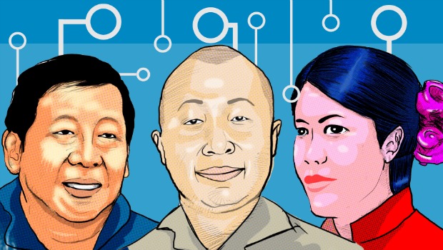
Once the list was compiled, we faced the problem of illustrating these Chinese elite, many of whom were private figures not accustomed to a media spotlight and who did not appear in photos we could use. We trimmed the background on the photos we had, while ICIJ worked with illustrator Jesús Pérez in Santiago, Chile, to create portraits of the rest.
But getting the illustrations right was its own task. Partners and project managers exchanged rounds of feedback between Washington, Santiago, Madrid and Hong Kong. One concern was that the illustrations might show the Chinese elite in a way that might bias a reader against them. Pérez tweaked the illustrations to show them in a neutral light.
The final list contained a daunting amount of information, which could include a person’s name, a short description, a position on a list of the richest Chinese, net worth, a long description of up to 100 words, relations to other power players, and between one to 50 offshore companies that the person was linked to – with the name of the company, the relationship to the person and the date of incorporation.
Just organizing all this information in a structured way was a major undertaking, as was fact-checking it all.
Originally, many types of data were collated into just two Excel sheets. To create connections between people and company records without duplicating records for each, we created new sheets for each type of data and used the names of people and companies to link these together. This was not easy to communicate to a team that was still editing the spreadsheets, and sometimes resulted in a broken interactive. If we were to do this again, that would be a process we’d think through more carefully.
Designing for infinite widths
 On the graphic itself, my colleagues at ICIJ insisted that every piece of information be displayed, and indeed, all of it was important. But how could I fit it all into an interactive graphic that could be embedded in a story? And how was I going to re-work that display into the tight confines of an iPad or iPhone screen?
Initially, each profile featured a photo of that member of the elite in the center, with connections drawn to either side, but this didn’t scale neatly or leave a natural spot to place text. After sketching designs on paper, and creating concepts in Adobe Illustrator, I opted instead for a structured design with neatly drawn connections between players along the left side — in the style of a schematic diagram. This meant that the interactive expanded and contracted to fit different screen sizes and page widths without the connections obscuring other information.
By the end of the project, I had written nearly 2,000 lines of JavaScript and CSS to draw the graphic, make it scalable and to provide interactivity.
 Each level of information fit into a tier, and to divide the tiers I used shades of blue. I hoped the blue would evoke the overseas nature of the offshore world. This was not without controversy. One person commented that the blue was “too dense,” which made the graphic “feel heavy.” At a meeting shortly before launch, those involved asked, “Could you make it red?”
I replied that I wasn’t sure, that black text and lines on a red background might be difficult to read. I tried a few shades of red, but remaking the design with a red background that worked seemed impossible in the time before launch.
Of course, most of our partners working with this material opted for web page designs featuring white background with red highlights, because the project was about China.
Found in translation
In order to distribute the interactive to ICIJ’s global media partners, we had to translate it from English into five additional languages. Luckily, the interactive loaded most of the text it displayed from external spreadsheets, which could be opened by programs like to Microsoft Excel. To translate it, we copied those into Google Spreadsheets, which let us collaborate on these easily, then ICIJ’s partners rewrote the English versions into Spanish, German, French, Korean and simplified Chinese.
The biggest challenge was keeping six different spreadsheets — one for each language — in sync with every change, and with testing every single update to ensure it worked and displayed well within the graphic’s many sizes. Thankfully, ICIJ’s Mar Cabra coordinated much of this. The translations written by ICIJ’s partners were published on a preview version of the interactive, which was reviewed by that partner. This usually resulted in the translator making more tweaks. Rinse. Repeat.
In a translation effort of this size, I expected to make several language-specific modifications to the software, but by-and-large, the code worked without many. There was a time when this kind of translation would have been difficult, as coders struggled with a computer infrastructure built by and for English-speakers, but in 2014, with the right tools and design, much of it just works. This was thanks to the set of international characters that now come standard, the relative simplicity of the interactive and the way the software loaded data from external files.
One culture-specific change I didn’t anticipate was how text labels along the left side of the app were rotated. In English and European languages, I rotated the whole label 45 degrees. But our Korean partners told us that in their language, this was not the most natural approach. Korean and Chinese languages were traditionally written vertically, from bottom to top. So I changed the code to render labels that way. I didn’t know this when I started, but with media partners in ten countries looking over my work, I didn’t have to.

By January 21, the interactive graphic and the story were ready for publication. Our work was splashed across partner sites seemingly everywhere, including Le Monde in France, Le Matin in Switzerland, Le Soir in Belgium, the CBC in Canada, Süddeutsche and NDR (public television) in Germany, Trouw in the Netherlands, the Korea Center for Investigative Journalism (KCIJ) in Korea and El País in Spain.
My favorite use was from KCIJ, which filmed a 28-minute mini-documentary exploring the possible social and financial importance of the leak, and using the graphic heavily to introduce video segments and tell the story.
Most importantly, hundreds of thousands of readers from those countries and others, including China, were able to examine the international business interests of China’s ruling class in unprecedented detail.